|
 |
The textured one, as you say, looks much better. I think this is mainly
because the irregularities of the pigment help to disguise the triangular
artifacts on the untextured image. Nice sea btw - how did you do it?
The posts that I have made in Noe's thread about 16-bit height-fields apply
here to a certain extent, but as you have used a quite steep slopes and
quite low-resolution height fields, they're not so obvious.
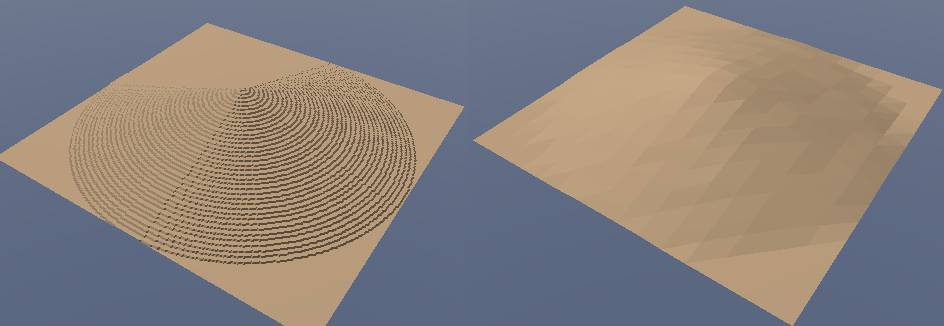
The attached image shows the same heightfield at a 255x255 (left) and 16x16
(right). In the high-resolution image, because of the small gradient,
several adjacent pixels of the heighfield are the same colour, then it
sudenly jumps to the a colour one brighter, leaving ridges of one colour and
when there is an increase). This is an artifact of using an 8-bit
heightfield
On the right hand image, the resolution of the height-field is low enough
for there to be several steps in height for each horizontal step of the
height-field, so the steps no longer occur and the image appears smoother.
Its just a pain that 16-bit images aren't supported well by most image
editing programs.
Of course, small details cannot be reproduced in the low-resolution
version - to avoid this problem altogether, a 16-bit heightfield means that
with even high-resolution height map, there are always several vertical
steps per pixel, so the artifacts do not appear.
-Chris
Post a reply to this message
Attachments:
Download 'heightfields2.jpg' (25 KB)
Preview of image 'heightfields2.jpg'
|
|